Integrating Technology in the Second Language Classroom

  
Jean LeLoup & Bob Ponterio 
SUNY Cortland 
© 2017
  Saying it with Style
Four Basic Principles
    from The Non-Designer's Design Book by Robin Williams
 
    Contrast: The idea behind contrast is to avoid elements on the page that are merely similar. If the elements (type, colour, size, line thickness, shape, space, etc.) are not the same, then make them very different. Contrast is often the most important visual attraction on the page. 

    Repetition: Repeat visual elements of the design throughout the piece. You can repeat colour, shape, texture, spatial relationships, line thickness, sizes, etc. This helps develop the organization and strengthens the unity. 

    Alignment: Nothing on the page should be placed there arbitrarily. Every element should have some visual connection with another element on the page. This creates a clean, sophisticated, fresh look. 

    Proximity: Items relating to each other should be grouped close together. When several items are in close proximity to each other, they become one visual unit rather than several separate units. This helps organize information and reduces clutter.

Dynamic Relationships
    from The Non-Designer's Design Book by Robin Williams
 
    A concordant relationship occurs when you use only one type family, without much variety in style, size, weight, and so on. It is easy to keep the page harmonious, and the arrangement tends to appear quiet and rather sedate or formal - sometimes downright dull. 

    A conflicting relationship occurs when you combine typefaces that are similar in style, weight, size, and so on. The similarities are disturbing because the visual attractions are not the same (concordant), but neither are they different (contrasting), so they conflict. 

    A contrasting relationship occurs when you combine separate typefaces and elements that are clearly distinct from each other. The visually appealing and exciting designs that attract your attention typically have a lot of contrast built in, and the contrasts are emphasized.


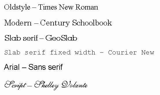
Font Basics


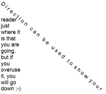
Type Contrasts

  direction


For more information:


Return to Syllabus