http://web.cortland.edu/flteach/wksp/nysaflt2013.html
Why am I talking about this?
Technology in the Second Language Classroom, SUNY CortlandWho is this presentation for?
Anyone who wants to put materials online via the web for display on SmartPhones or Tablets (whether or not you know much about web design).This presentation offers only the simplest, basic bits of responsive design needed for creating fairly simple web pages for displaying content on student phones or quickly converting your existing content so that it will display better on these smaller devices.
a. Problems displaying and interacting with most web pages on tablets & smartphones.
b. Solutions: easier clicking, self-adjusting columns, auto resizing of images, readable text, changing content for different screen sizes, reducing indents on small screens, making videos elastic.
c. Responsive Design (using Media Queries, Cascading Style Sheets (CSS), & Fluid Grid layouts).
d. Need to make this easy & transparent for the teacher because you don't have time for Media Queries, CSS, or Fluid Grid layouts! (In other words, you want to focus on content, not format, so we must keep it simple.)
e. Should we design a page for a wide, desktop screen and then include responsive design styles to make it fit better on a SmartPhone? Or should we design the page for a SmartPhone first, and then let it scale up to also display on a desktop? A third approach is to make separate pages for each, and jump/redirect to one depending on the screen size.
f. Might we make two different pages for narrow or wide screens? Then we could automatically jump to the appropriate version depending on screen width.
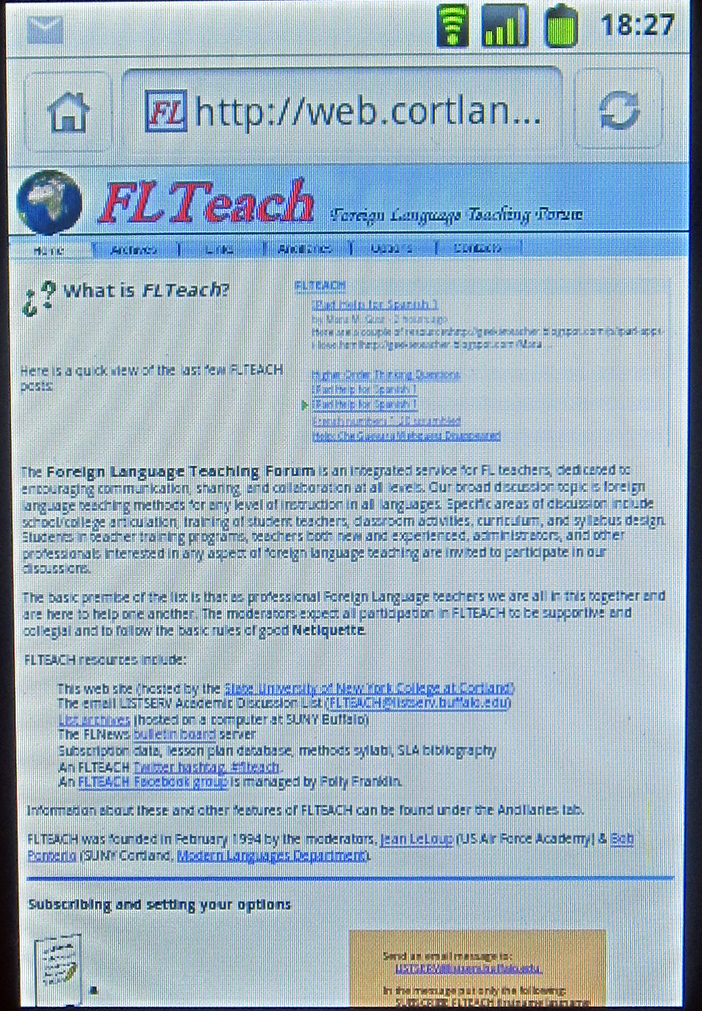
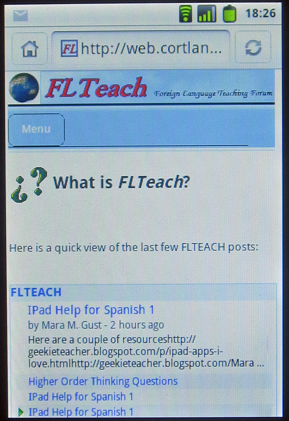
These sample pages below, photographed on a smartphone, show a before/after comparison of some of these Responsive Design features. The images are linked to the original pages. Note the improved usability of the improved pages.


A. Cascading Style Sheets help us separate format from content:
Responsive Styles in an External CSS file:
Put all responsive design related styles in a separate css file (for example "responsive.css").
Tell the page to get the styles from that css file:
<link href="responsive.css" rel="stylesheet" type="text/css">
Responsive Styles in a web page header:
Put responsive design related styles between <style> tags in each web page header:
<style>
img {
max-width:100%;
width:auto
height:auto;
}
</style>
Inline Styles:
Put a responsive design related style directly into one particular item on a page:
<table style="width:100%;">
B. <DIV> </DIV>
DIVs are just boxes that can be defined as having a width that is a particular percentage of the box they are contained in. A bit like tables that can move around and adjust to their environment. They are far more effective and versatile than tables for formatting a web page.
Example of a DIV class to make 3 columns:
/* GRID OF THREE */
.span_3_of_3 {
width: 100%;
}
.span_2_of_3 {
width: 66%;
}
.span_1_of_3 {
width: 32%;
}Example of DIV class that is hidden or displayed on a cell phone:
.hidden_on_phone {
width: 100%;
display:none;
}
.display_on_phone {
width: 100%;
display:block;
}
C. Media Queries (a way to tell the page how much room it has on the screen):
Change the style if the screen is no bigger than a pre-determined size.
Example of a Media Query setting for a smartphone to make a normally 1/3 screen size column fill the width of the smartphone screen:
@media only screen and (max-width: 480px) {
.span_1_of_3 {
width: 100%;
}
}And finally, to make it all work, we have also added a Meta tag in the page header:
<meta name="viewport" content="width=device-width, initial-scale=1.0">
D. Smartphone first design:
Another option is to design a page first for the smartphone:
Single column; Nothing wider than about 320-480 pixels; Avoid too many indentation levels; Image width set by percentage (indeed many objects can have - style="width:100%" ).
E. Make two pages, one for SmartPhones, the other for wider browser windows:
Yet another option is to make different pages for different media. You can make a separate page for a SmartPhone and automatically jump to it if the browser window is narrow. To do this, you can paste this script into your "normal" wide screen web page head area and change the document.location to automatically jump to your mobile page if the width is less than 480 pixels:
<script type="text/javascript">
<!--
if (window.innerWidth <= 480) {
document.location = "http://my.mobile.page.address.goes.here/";
}
//-->
</script>Now when the visitor loads your "regular" web page from a SmartPhone, it will automatically jump to the SmartPhone version. Of course, this is more work, but it can make the design easier if the differences between the two versions are great.
The Media Queries, Styles & DIVs for all of these are included in the headers of each page.
2 column design with hidden DIVs
Use a few basic templates instead of starting from scratch each time.
I am incorporating all style information needed for all of these Responsive Design templates into every sample template (in its header) so you don't have to bother with external style sheets.
- However, if you are comfortable with CSS, putting responsive design in an external style sheet is really a better approach.Always avoid using absolute sizes such as an image width & height specified in pixels (don't include any size info in images). Avoid a table or column whose width is in pixels (use % instead). This might require checking the HTML properties of images to delete width & height.
You can download these templates, fill in your own content, and copy & paste sections (be careful to respect section boundaries) to add or rearrange format sections. I will put a horizontal line between sections help you see the section boundaries and make it easier to copy/paste whole sections.
The first layout is just a single column blank page with no special sections or areas, intended for SmartPhone first design. You should be able to copy/paste your existing web page into this single column layout.
Reformat any special wide layout elements you might have (wide tables).
Remove image width & height.
Move things around so you have just a single column of content.
Keep any indentations to a minimum.
Right click on each link to download that template. Each is just a single file that can be edited to insert your content and modified to your preferred format features.
This is a page with just a single, full-width column. A blank slate.
Use this layout for SmartPhone first design.
class="col span_3_of_3"
class="col span_2_of_2"
Header
This is a page with a single, full-width column.
It also has a header and a footer section.
class="col span_2_of_2"
Footer
Header
Left column
span_1_of_2
Right column
span_1_of_2
Footer
Header
Left
Right
Full width section
Footer two_columns_plus_full_width.html
Header
Full width section
Left
Right Footer full_width_plus_two_columns.html
Header
Left column
1_of_3
Right column
span_2_of_3
Full width section
Footer two_columns_unequal_1_third-2_thirds.html
Header
Left column
span_2_of_3
Right column
1_of_3
Full width section
Footer two_columns_unequal_2_thirds-1_third.html
Header
Left 1/4Right 3/4
span_3_of_4Full width section
Left 3/4
Right 1/4 Footer two_columns_unequal_by_fourths_plus_full_width_section.html
Header
Left
Right 2 DIVs
1. Hidden on cell phone
class="hidden_on_phone"
2. Hidden on wide screen
class="display_on_phone"
Full width section
Footer hidden_sections_plus_unequal_columns_plus_full_width_section.html
Header
Left
Col 2 Col 3 Right Full width section
Footer four_columns_plus_full_width.html
Redirect page: This page has the script to automatically redirect you to a different page for a smaller browser window (less than 480 pixels).
Using web page editors: Dreamweaver & Kompozer
Copy/Paste sections
Remove height & width from images so they get their size from their containers.
Checking your work: Firefox / Tools / Web Developer / Responsive design view
Checking you page online: http://springload.responsinator.com/